How to write a homepage
Your website’s homepage is like the train station of your business. Unlike the rest of your site, it needs to hold the information for each of your ideal customers or clients (because you might have more than one), on this single page, without becoming overwhelming or confusing. Which means there will be lots of people landing on this page trying to find out what you do and how to get further information from elsewhere on your site.
Because of this, homepages can be tricky to write.
Writing your own homepage with a template
If you’re attempting to write your own copy, a template is a great place to start. And I’ve made one for you so you don’t have to go scrabbling around the internet trying to figure out how to turn a blank page into something you can publish. Just don’t nail yourself to this or any other template, because you’ll end up looking and sounding the same as everyone else who has used it.
Use this template as a starting point and amend it, expand on it, wiggle it about to make it suit your business and your voice.
The guide below can help you to write your own homepage from scratch or review your current one. It works as a stand alone guide or in conjunction with the template. If you’re completely new to copywriting I’d recommend using both the guide and the template hand in hand.
Off we gooooooooo!
Navigation
Your navigation header should show the other most important areas of your website that people can navigate to. There’s no hard and fast rule on what this should look like. You might have them across the top in a straight line, or some to the left and some to the right. You also get to choose what those areas are, depending on what your business is about and what you sell. Research shows that most of us read in an F pattern, so place your most important links to the right, as that’s where our eyes are most drawn to.
Above the Fold
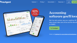
The “above the fold” or “hero” section is everything you see before you scroll down. It’s the most important part because what you say there has to make people want to stay on your site. It should be really clear what you do and who you serve. Try the 5 second rule. Ask someone to look at your homepage for 5 seconds—no more—and then ask them to tell you what they understood from what they saw in that short space of time.
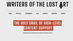
Your Headline, or H1, should be smart, captivating and include your main keyword.
A sub-header underneath your captivating headline, should be a statement that expands on what you do, but be reader focused. They need to see how they could benefit from working with you or buying from you.
See these examples below.


Benefits
If people scroll down the page or click into a “read more”, now is the time to sell your offering so that the reader can understand what’s in it for them. Keep it reader, or “you” focused but think about answering some of the following:
- What are the benefits of working with you or buying from you?
- Why should they choose you?
- What makes you qualified?
- What are your values?
- Why do you do what you do?
- How can that be helpful for them?
You could probably write a whole page on this, but choose your words wisely and stick to no more than 5 lines. A short introduction to you and your business.
Services or Features
Sell your services in this next part. Be clear. People want to know exactly what they’re buying or signing up for. What do they get? BUT, it also needs to be concise. Add a button so they can click through to a services page for a full breakdown of what’s included.
Social Proof / Convincing
Now you need to convince your reader that they should choose you, or go to another page on your website for more information. Social proof can be testimonials, reviews, portfolio examples, or some statistics about how many people you’ve helped or products you’ve sold or success.
About / Your Story
In this section, introduce yourself a bit more personally. Who are you? And what do you do? Add a button to click through to an “About” or “Our story” page where you can really go to town on how your business came about.
Lead Magnet
Got a freebie you want to share? A download? A webinar? A newsletter? Add it in this section. Lots of businesses produce lead magnets in which you need to give your email address in order to get access. It’s a great way to build an email list, give an incentive for people to join and for the audience, it’s low risk. However, you must make sure your freebie is high value. Give away as much as you can because it will only serve you better.
Resources
This is your opportunity to build more trust and show that you are an authority in your field. Share your blog and socials so that people can follow you. They may not be ready to buy from you yet, but willing to engage with you in other ways.
Closing Call To Action
End your page with a final call to action. This could be to sign up for a discovery call, book an introductory call, or buy a product or a service. What is it that you’ve been slowly leading people towards on this page? This is your last chance to persuade them, so make your CTA compelling.
Footer
And last but not least, your footer. Like the navigation this will appear everywhere on your site. Don’t overload it, but add important links here that you want people to be able to find and access easily. Terms & conditions, copyright, privacy policies, contact and any important logos should go here too, as well as social icons.
This is my first attempt at a page template, so I’d love to hear what you think of it. Pop me an email at danielle@writersofthelostart.co.uk if you have any feedback, good or bad!
And if you need help with your website, fill in my short questionnaire and I’ll get back to you with a quote and details of how you can take your next steps towards great copy. Yes, even if that means signposting you to someone else!
August 9, 2024
What is conversion copy?
December 29, 2024
What is the S.A.F.E Method?©
April 16, 2024
10 Reasons you should be blogging for your business
May 4, 2023


